LiquidGlass/
By Apple™
Apple

Apple

Human \nterface Guidelines

Eight Apple Design principles for UXU\ A\X

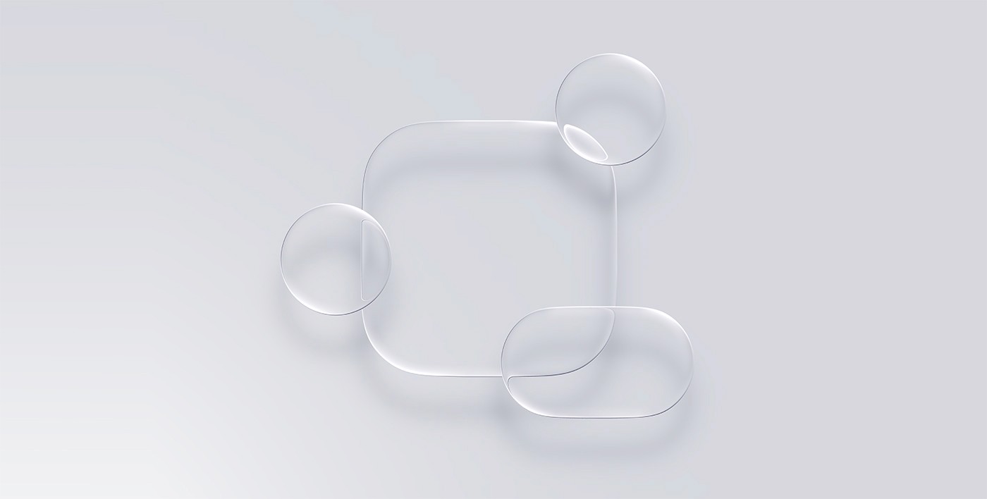
Explore fundamental principles that guide design across Apple platforms. The most successful and enduring designs are based on a deep understanding of how people think, feel, and interact with the world. The principles here reflect this reality, and form the foundation for guidance throughout the Human Interface Guidelines.
H\G Design Principles

Apple Liquid Glass 2027

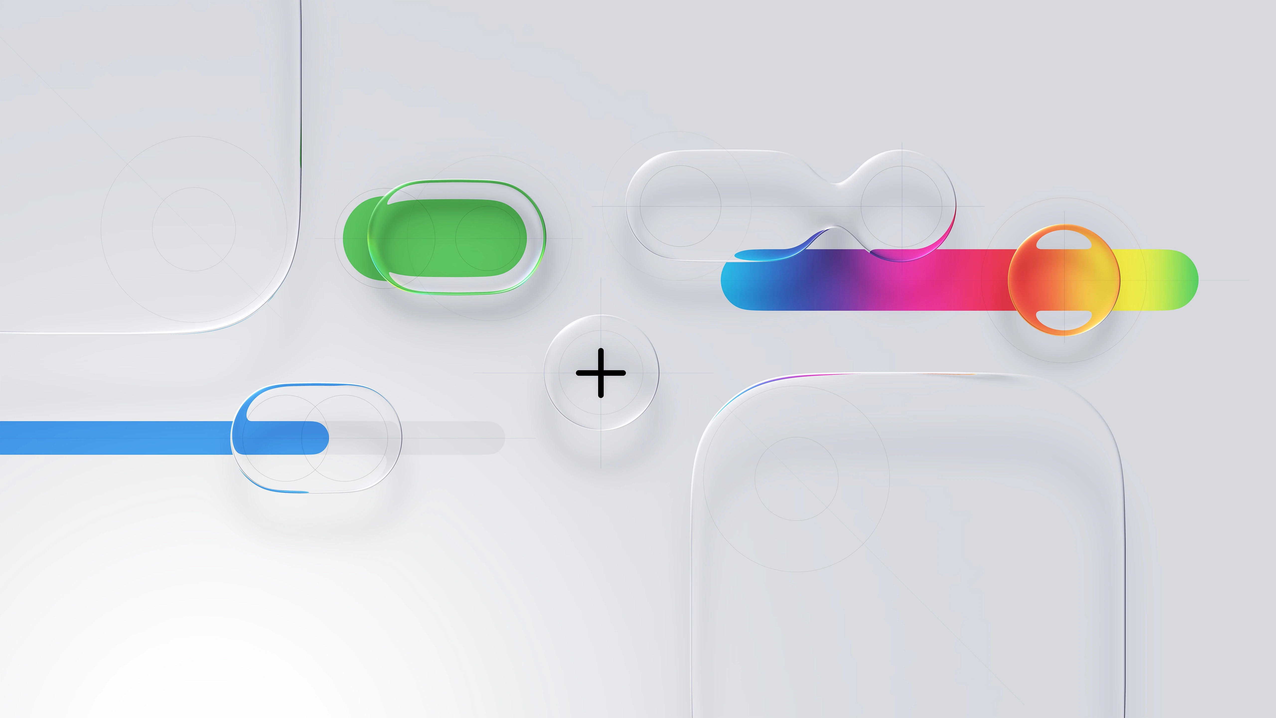
A new era to integrate seamlessly each Apple platform.

Adopting Apple Liquid Glass
Apple Human Interface Guidelines

Think it. Build it. Deliver it. Mean it, and Tweak it.

Apple Liquid Glass 2027

Powerful scalable components in action.

HIG Considerations

Apple Liquid Glass 2027

A new era to integrate seamlessly each Apple platform.

Adopting Apple Liquid Glass
Apple
Liquid Glass

Design System

Liquid Glass Design System

Liquid Glass
Design System

From zero speed in the making of human interfaces
to the speed of thought in the making of User Interfaces.

From zero speed in the making of human interfaces
to the speed of thought in the making of User Interfaces.

From zero speed in the
making of human interfaces
to the speed of thought in
the making of User Interfaces.

AI-driven plugins like Autoflow, Content Reel, and Magician expand creativity at every stage—generating text, images, flows, and logic snippets. Widgets empower teams to bring interactivity to ideation, with polls, timers, and feedback tools right inside FigJam or Figma. The ecosystem becomes a playground for rapid, intelligent iteration.

AI-driven plugins like Autoflow, Content Reel, and Magician expand creativity at every stage—generating text, images, flows, and logic snippets. Widgets empower teams to bring interactivity to ideation, with polls, timers, and feedback tools right inside FigJam or Figma. The ecosystem becomes a playground for rapid, intelligent iteration.

AI-driven plugins like Autoflow, Content Reel, and Magician expand creativity at every stage—generating text, images, flows, and logic snippets. Widgets empower teams to bring interactivity to ideation, with polls, timers, and feedback tools right inside FigJam or Figma. The ecosystem becomes a playground for rapid, intelligent iteration.

And yet. Changing the world, one screen at a time.

And yet.
Changing the world,
one screen at a time.


Consistency Adopt platform conventions to maintain a consistent design that continuously adapts across window sizes and displays.
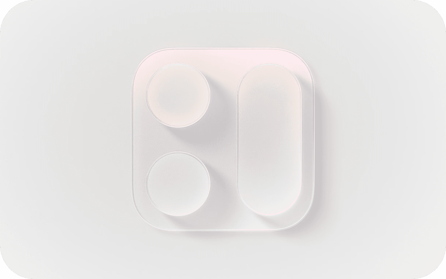


Hierarchy Establish a clear visual hierarchy where controls and interface elements elevate and distinguish the content beneath them.
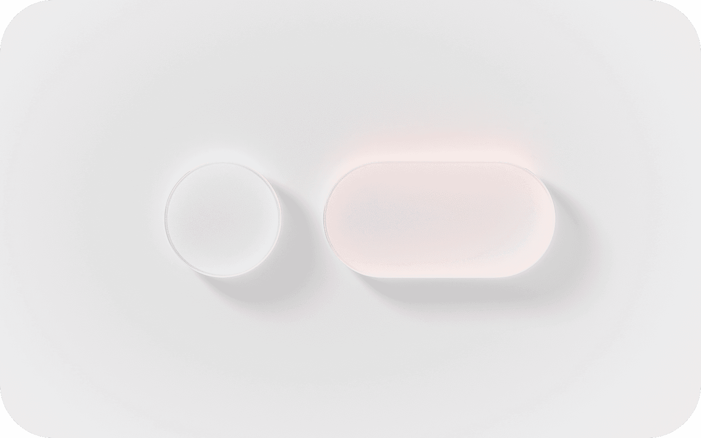


Harmony Align with the concentric design of the hardware and software to create harmony between interface elements, system experiences, and devices.
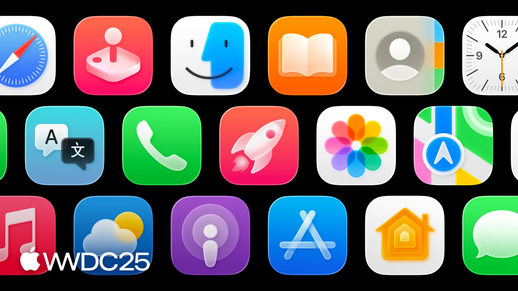


H\G

H\G

Apple’s Human Interface Guidelines [H\G]

—serve as a comprehensive resource for developers and designers as myself to create intuitive, user-centered interfaces. The guidelines emphasize principles such as clarity, consistency, and responsiveness, which are critical for crafting seamless and visually appealing user experiences.

Foundations
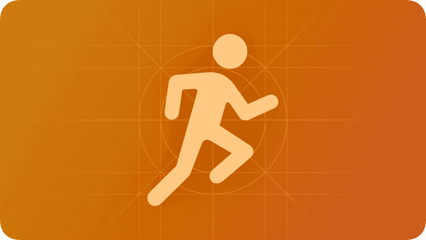
Patterns

Components

I/O

Technologies

Apple Human \nterface Guidelines H\G

SDK

SDK

User Interface [U\] APIs are the building blocks of digital experiences —reusable elements like buttons, input fields, modals, navigation bars, and cards that work together to create consistency and clarity across a product. Well-designed components follow established design systems and accessibility standards, ensuring a seamless user journey while also streamlining development. As a UX designer, defining and refining U\ components means balancing aesthetic precision with functional purpose—ensuring every interaction feels intuitive, responsive, and aligned with user needs across devices and platforms.



mapKIT API

healthKIT API

multimediaKIT API

homeKIT API

sceneKIT API

Xcode™ Kits/APIs


Apple™
Software Dev Kit
[SDK] — a powerful and thoughtfully crafted front-end framework designed for building Apple applications with consistent UXU\ A\X.

Whether prototyping remotely or on-site with Figma, optimizing UI tools and workflows, or scaling for Web3, FIG.™ is here to streamline your Agile atomic design systems.


Whether prototyping remotely or on-site with Figma, optimizing UI tools and workflows, or scaling for Web3, FIG.™ is here to streamline your Agile atomic design systems.


Apple
Figma
SDK27
Liquid
Glass
Design
System
Reference
Library

Apple
Figma
SDK27
Liquid
Glass
Design
System
Reference
Library

Apple
Figma
SDK27
Liquid
Glass
Design
System
Reference
Library

A11y Optimization

Animations/Effects

Automated SEO

Built-in Analytics

Content [CMS]

Components

Forms

Layout

Project Styles

P3 Color

Rich Media

Carousel

Slideshow-Tickers

Sticky Scrolling

Link Styles

Overlays

Responsive Design

Text Styles

Sticky Scrolling

Parallax Scrolling

Custom Cursors

Visual Breakpoints

.

1

3
Apple™ LGDS

Apple™ SDKs — the foundation for building seamless, secure, and powerful apps across Apple platforms. Designed to accelerate development while staying true to the Apple experience.

Adobe™ SDS

{

01

}

Apple™ LGDS

{

02

}

Google™ M3DS

{

03

}

SalesForce™ LDS

{

04

}

Meta™ HDS

{

05

}

SAP™ FDS

{

06

}

Adobe™ SDS

Adobe Spectrum — the design system powering consistent, accessible, and scalable experiences across Adobe apps. Built to help teams move faster, stay aligned, and design with clarity.

Adobe™ SDS

{

01

}

Apple™ LGDS

{

02

}

Google™ M3DS

{

03

}

SalesForce™ LDS

{

04

}

Meta™ HDS

{

05

}

SAP™ FDS

{

06

}

Adobe™ SDS

Adobe Spectrum — the design system powering consistent, accessible, and scalable experiences across Adobe apps. Built to help teams move faster, stay aligned, and design with clarity.

Adobe™ SDS

{

01

}

Apple™ LGDS

{

02

}

Google™ M3DS

{

03

}

SalesForce™ LDS

{

04

}

Meta™ HDS

{

05

}

SAP™ FDS

{

06

}

.

1

3

* SCROLL DOWN * or SCROLL UP